Oncue


Homepage
Problem
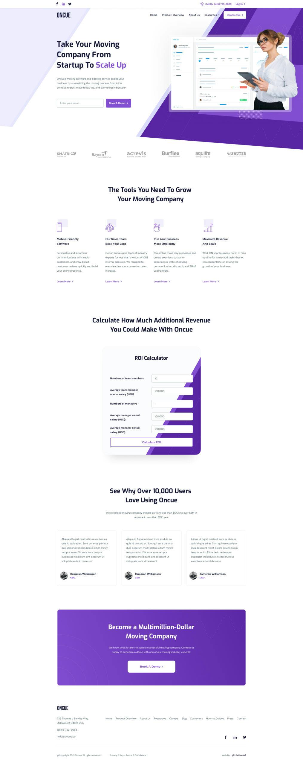
The header on the first page clearly outlines what the company does. We also added an email field for early lead capturing since that is a major goal of B2B websites!
Solution
The header on the first page clearly outlines what the company does. We also added an email field for early lead capturing since that is a major goal of B2B websites!
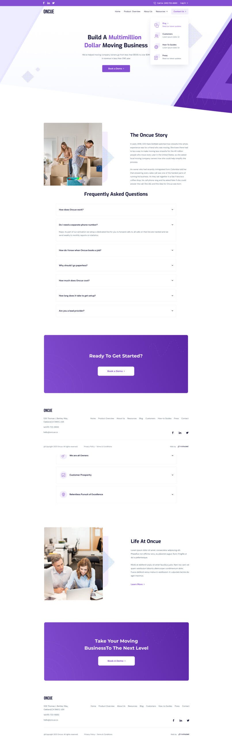
About us Page
Problem
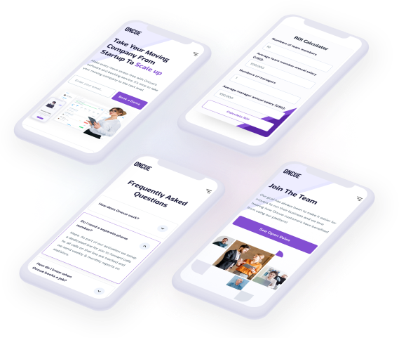
The header on the first scroll shows a prominent statement of what the company is about. There is also a CTA button that's calling visitors to Book a Demo. The rest of the page is clear and simple.
Solution
The header on the first scroll shows a prominent statement of what the company is about. There is also a CTA button that's calling visitors to Book a Demo. The rest of the page is clear and simple.
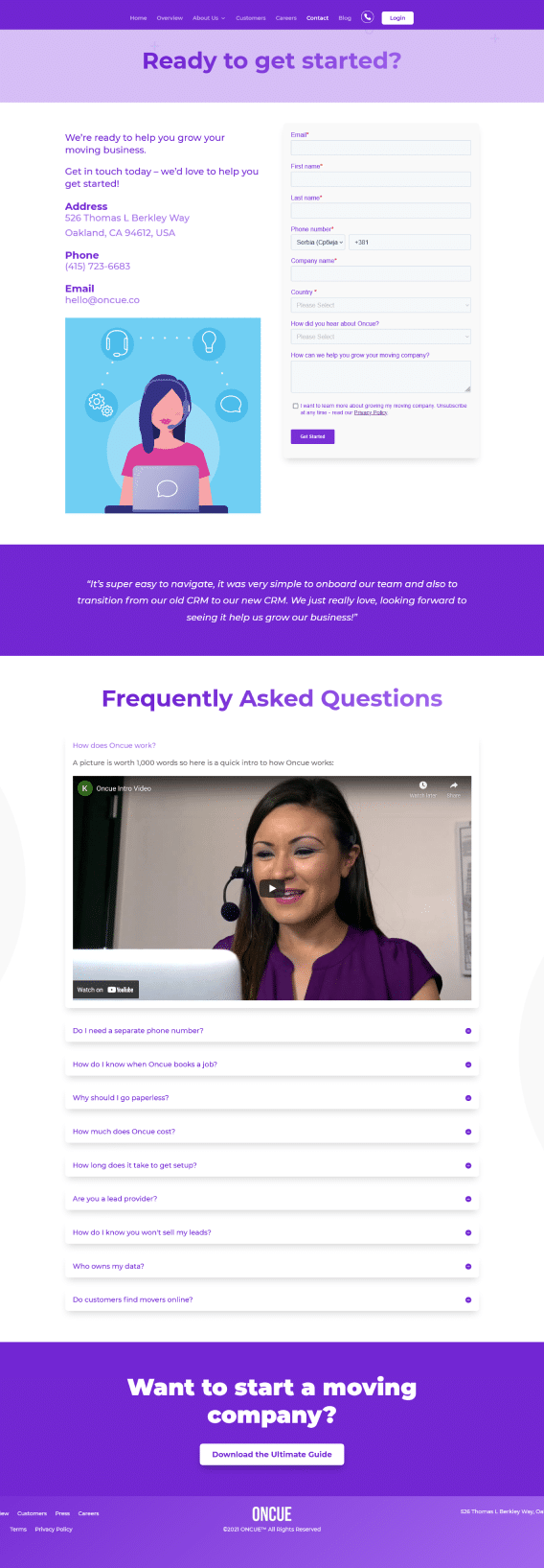
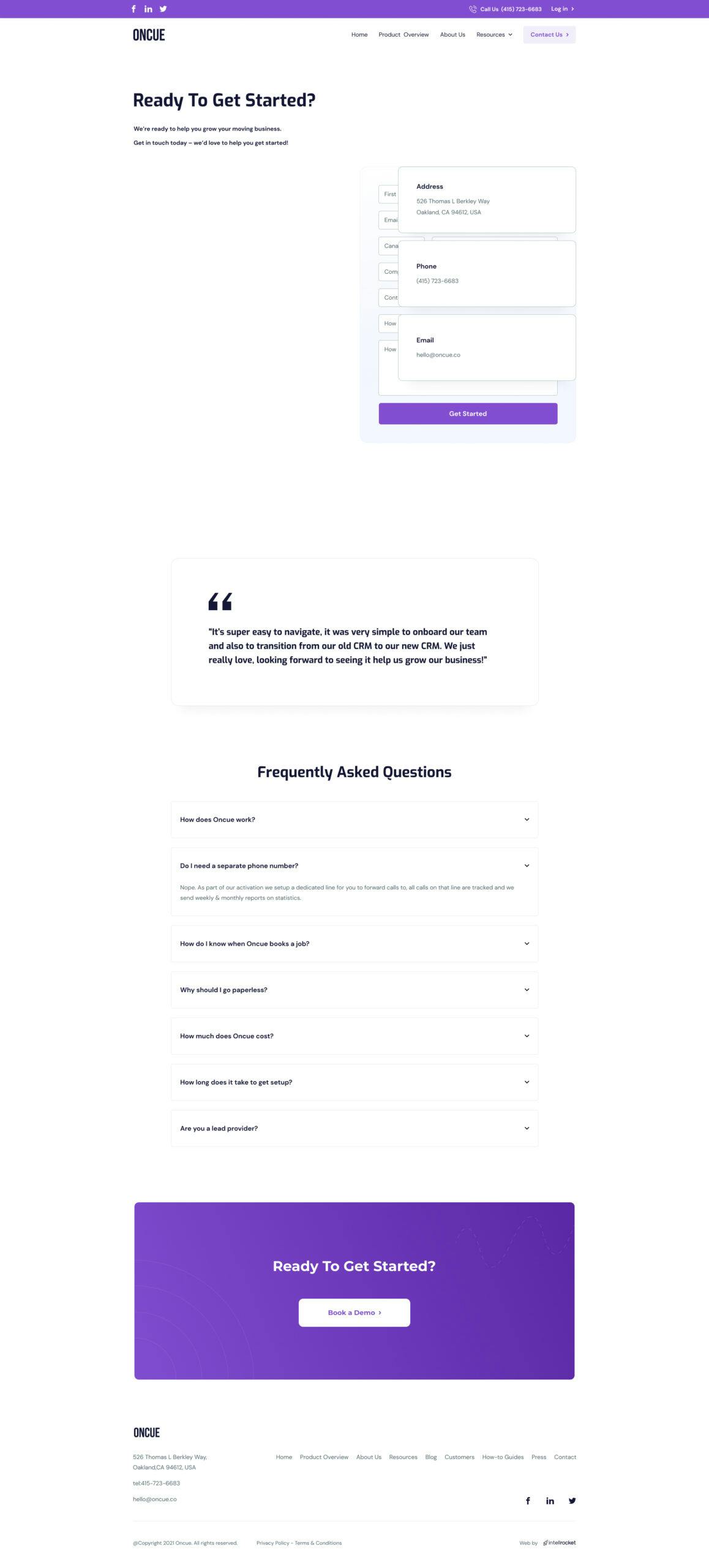
Contact Page
Problem
The new contact page is focused on the contact form, while content on the left is written to increase trust in the company and to convince customers to leave their contact information. Also, the customer testimonial adds more confidence in the company.
Solution
The new contact page is focused on the contact form, while content on the left is written to increase trust in the company and to convince customers to leave their contact information. Also, the customer testimonial adds more confidence in the company.
Our Case
Interested to learn more about the project? Check out this presentation and what we did for a better look and feel!
Read More