reTyre
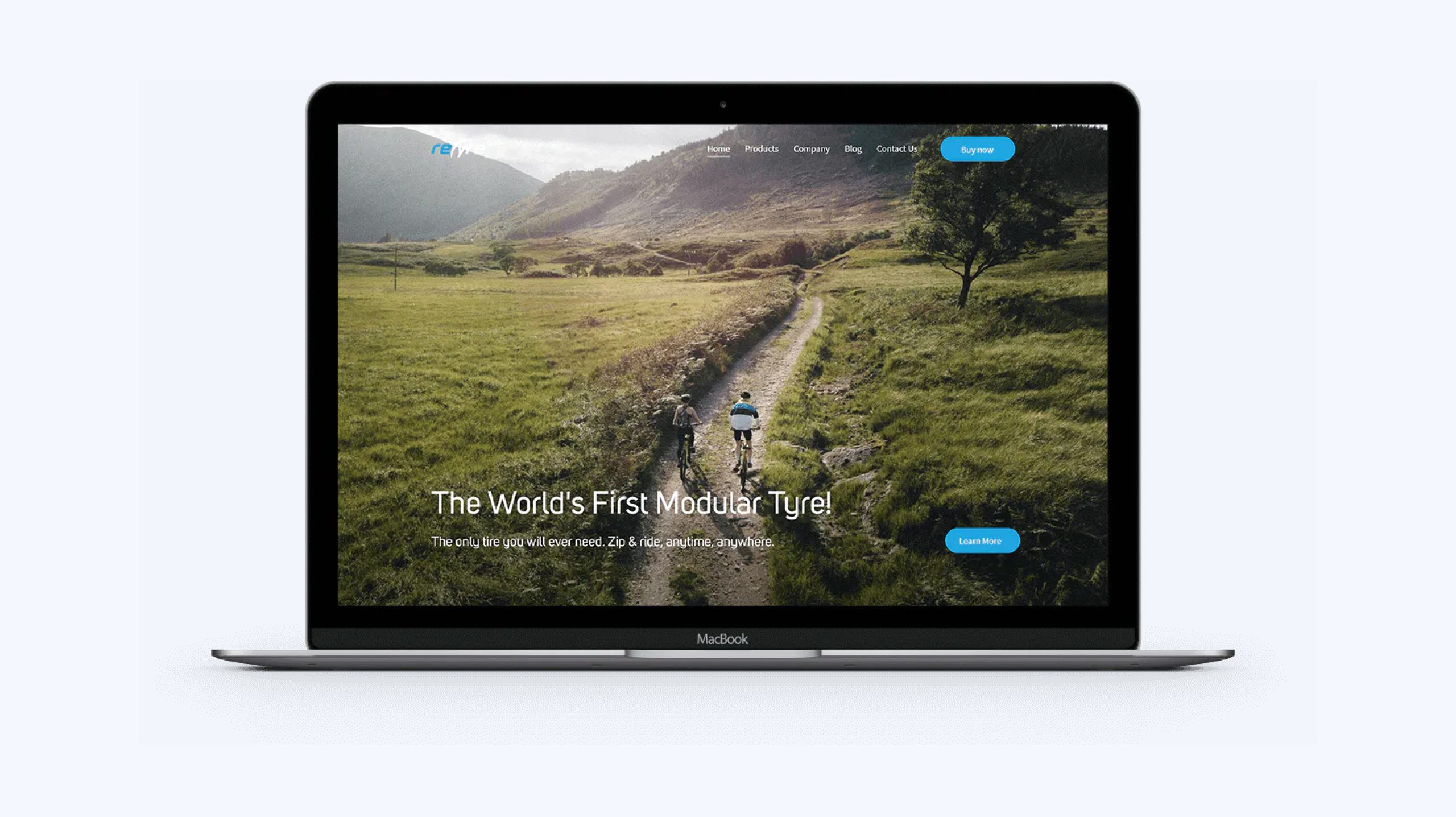
reTyre is an innovative start-up company that made the first ever modular bicycle tyre, for which they received a few prestigious awards, including the Red Dot Design Award for highest design quality. Working with a company that aspires to be different and strives to set the trends allowed us to present their brand in a unique and creative way.
Introduction01
Project Overview
For reTyre's new website, we aimed to simplify the discovery of their revolutionary bike tyres, ensuring every visitor grasps their innovative concept effortlessly.
- Discovery & Strategy
- UX/UI Design
- Web Design
- WordPress development
- Website Development
Design Style02

For reTyre, we opted for Uni Sans to enhance clarity and legibility. Our color palette, featuring a vibrant blue, clean white, rich gray, and deep black, was carefully chosen to reflect the biking industry's energy and expertise, resulting in a user-friendly and visually cohesive experience.
HEX #20a5df
HEX #eaeaea
HEX #ffffff
HEX #1a0901
HEX #20a5df
HEX #eaeaea
HEX #ffffff
HEX #1a0901
Typography


The Challenge
Good web design lets the product speak for itself. We had to find a way to achieve this, explaining along the way what reTyre is and how their products work. It’s never easy to design a website for a new product. The challenge is greater because you have to find the perfect balance between a clean, user-friendly design and content-rich guides that explain the purpose of the innovative products.
The Approach
Since we were dealing with creative and innovative tyre solutions, we found that the best way to approach the design is by letting the pictures and animations showcase the value of the products. The main idea was to allow visitors to find all the necessary information about the products using the intuitive site navigation and create attractive visual experience that will make them stay long enough to truly understand the benefits of the products.
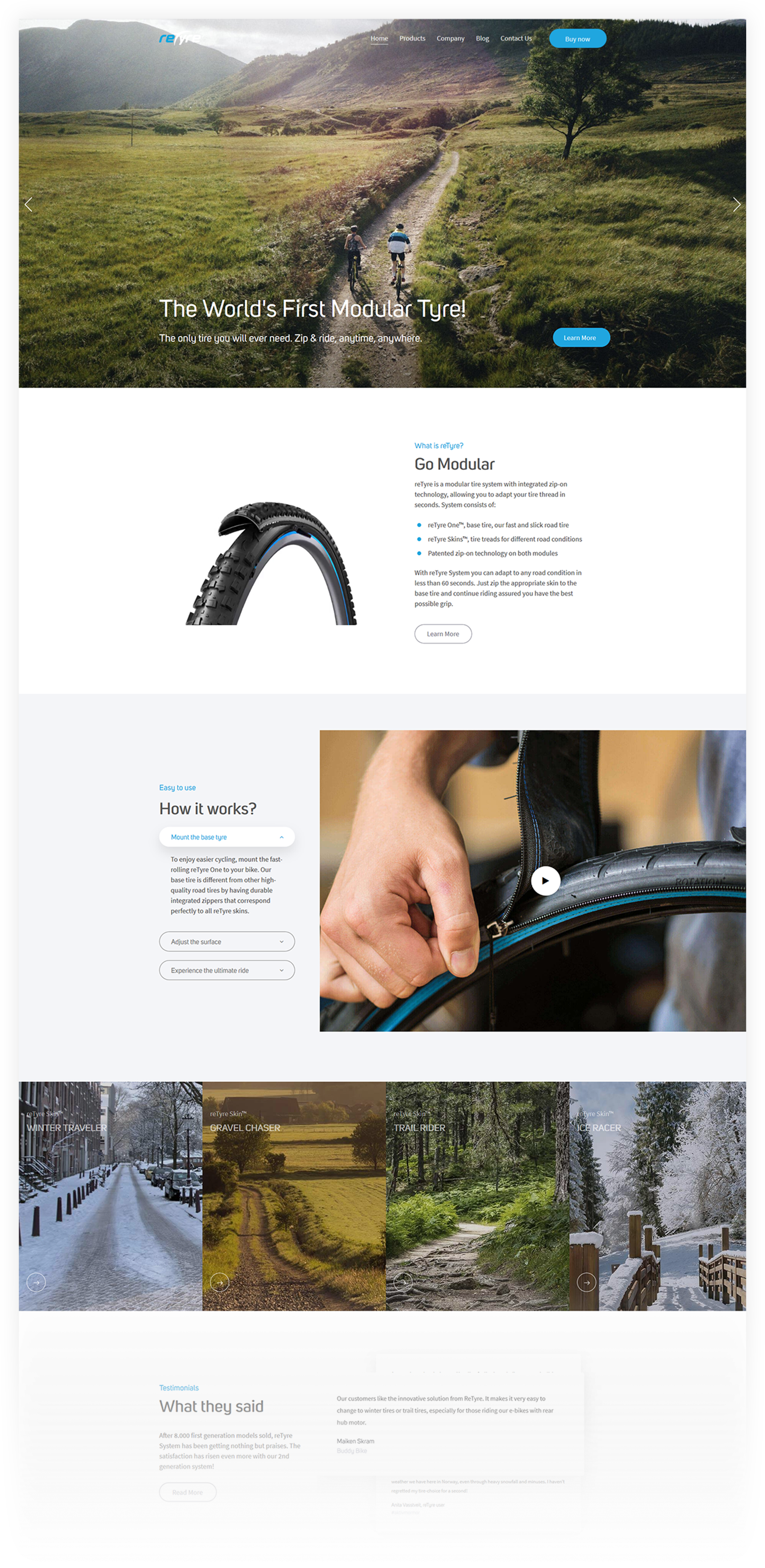

Product Selection
Showing the product selection on the homepage was our priority and we did it with an engaging animation displaying all the possible terrains and weather conditions in which reTyre products can enhance the user experience.
Product overview
With new and creative products, it takes time for customers to accept them. Reading the product description may engage a few visitors but seeing how the product looks and what it does is a more effective way to present it. That’s why we have combined text and animations to showcase reTyre’s products, focusing on appearance and functionality.
Application
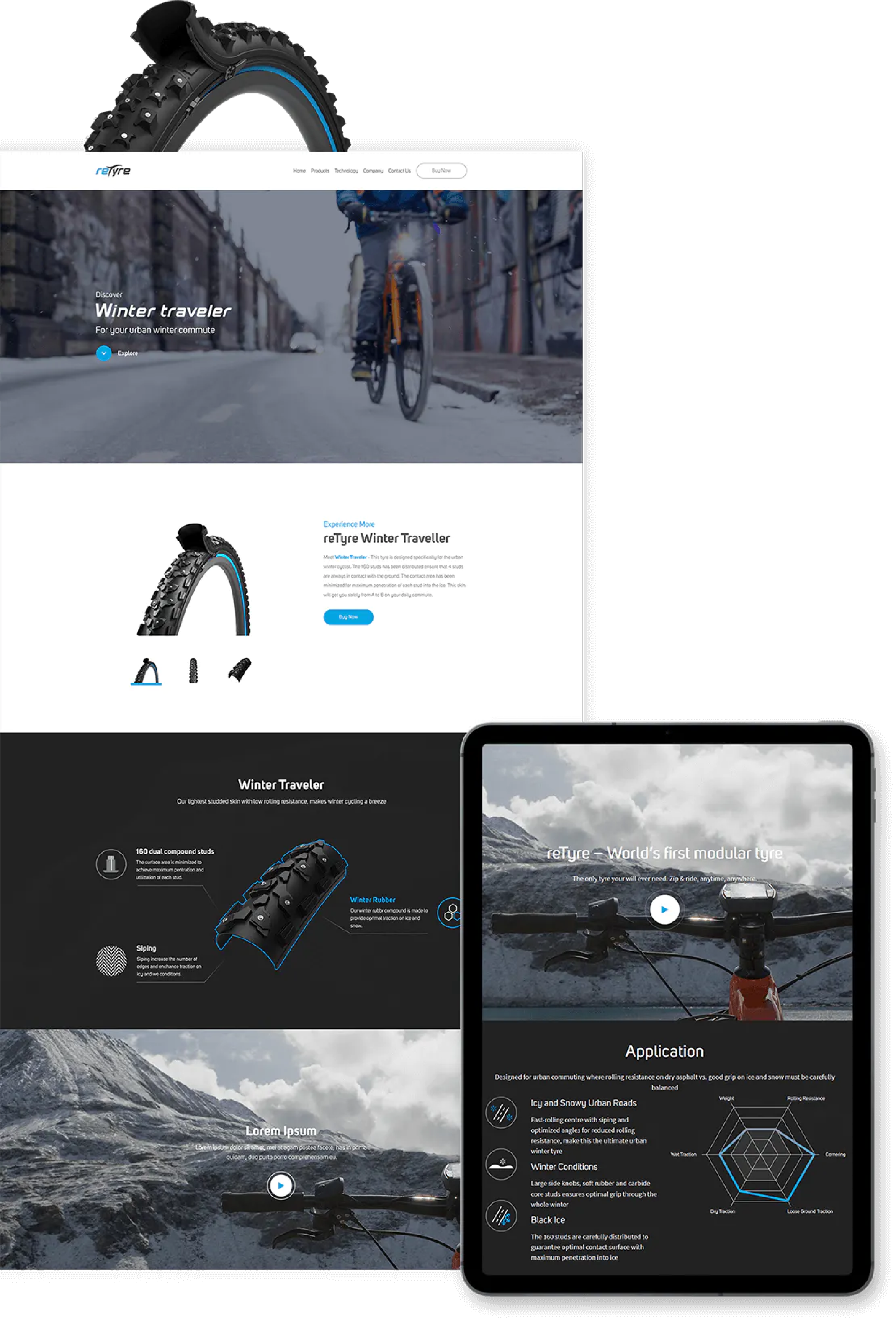
Explaining why these modular bicycle tyres are unique was always the primary goal of our web design. We found that simple graphic animation can point out all the product’s features in a quick, effective manner.
Product Landing Page06
Product Landing Page
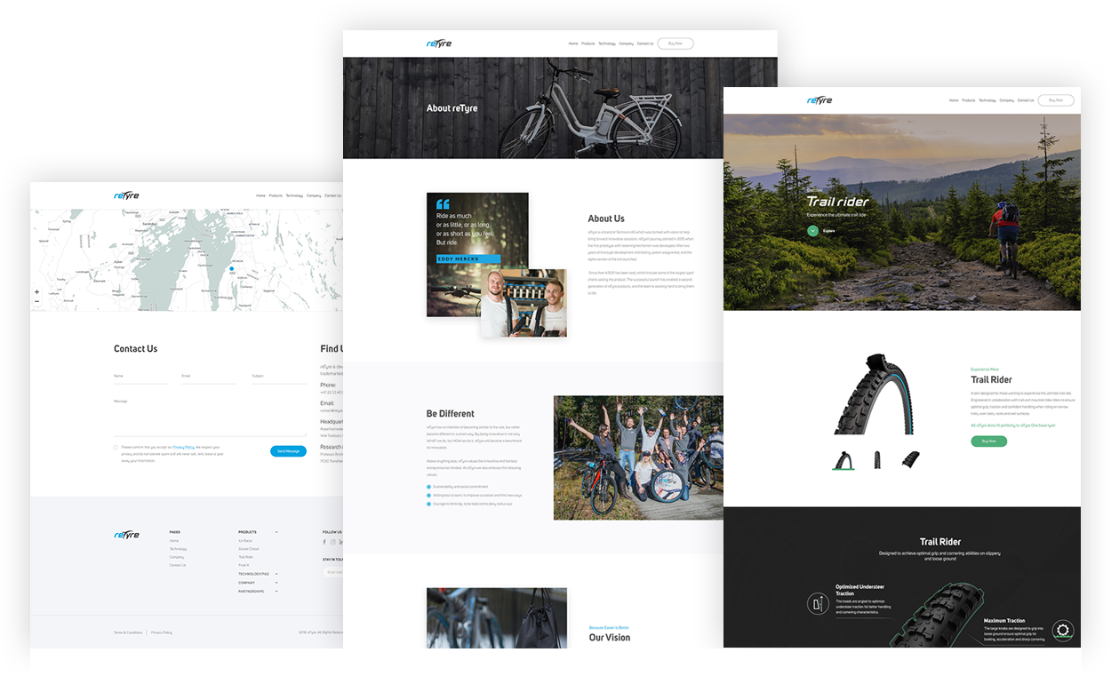
Appealing photographs, useful animations and detailed product information focused on different applications of each item, are vital building blocks for product landing pages designed to draw the attention of the visitors and spike their interest in the products.


Results
The site has received much praise from several sources. ReTyre's clients and partners were delighted with our work. Also, all our clients and partners praised the innovative product and our work. Visit the site to get the best impression.
